Graphic Design
Project: Don't Drink and Drive
Material: Advertisement
Client: U&LC Magazine
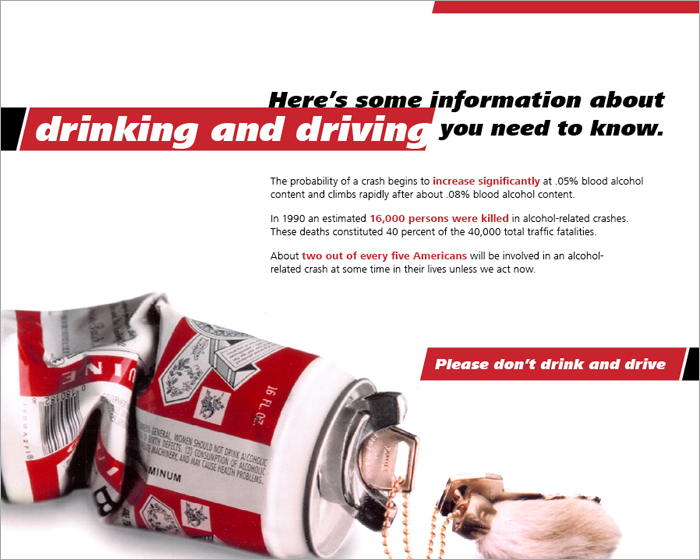
The creation of this ad was in response to a design competition on drinking and driving sponsored by U&LC magazine. The concept I developed was to use the crumpled beer can as a metaphor for a car crash – to illustrate the disregard for public safety of drinking and driving as casually as crumpling a can and throwing it in the trash. I created and photographed the beer can and ignition switch used in the ad.
QUESTIONS OR COMMENTS? Email us.
© Arthur Schening 2011. All rights reserved.
